About The Project

Smile MEDIA created a robust online platform for give IT. get IT.®, a non-profit organization founded in 2002 with a mission to help non-profits, families, and individuals overcome what hinders access to technology. In addition to helping those in need find affordable, used computers and to get the support and training to use them to better themselves, the organization also works hard to decrease electronic waste through the recycling of old technology.
To carry out their mission in the most efficient manner, the organization needed a platform that allowed people to apply for affordable access to technology and support, but also allowed for individuals and businesses to support those in need through alternative recycling, sponsoring individuals, families, and technology projects, donating funds, and volunteering their time and resources. They also wanted to streamline the workflow and reduce the duplicate data entry for tracking donations, destruction of data and distribution of assets and training. This also helps with their compliancy requirements and will help them scale with maximum efficiency in the future.

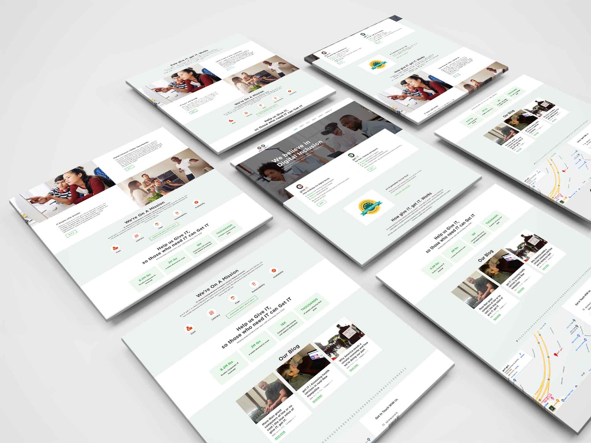
Smile MEDIA built a multi-faceted website to represent each of the opportunities the organization offers, with a user-friendly navigation, responsive website design, and compelling graphics to maximize the entire user experience. We also consolidated a number of websites into one site and rebranded their business to "Give IT Get IT". When doing this we wanted to make sure we did not compromise their traffic flow but rather spring from the efforts with the idea to increase their SEO and ease of management, all while adhering to best practices in development so they don’t grow too quickly.
Challenges
One of the biggest challenges for this project was the amount of content that needed to be easily accessible to users. It was important to organize the vast amount of information so it could be available as needed, but without crowding the site. Rebranding the organization was another top priority which required creative thinking and strategy. Another challenge was building a structured website that was both easy to understand and navigate for those looking for technology assistance and those looking to give equipment, time, and other resources. Connecting buyers, donors, recyclers, and volunteers on a digital platform that was secure and easy to navigate required strategic planning and functionality testing throughout the project. Additionally, integrating the back office with data capturing, workflows, and ecommerce required complex technology.
Solutions
The final solution was a robust and fast website which is minimalistic in nature, helping the organization to achieve its mission to reduce e-waste through and provide technological support to those in need to help boost their livelihood. The website also complies with all the necessary criteria of Google, which positions it well to rank high in the search results for their desired keywords. We integrated Salesforce with all online actives so they can manage clients, students and donors efficiently in their back office, and we are adding an online store with the same streamlined approach.
Technology
-
WordPress CMS
-
GTM
-
Bootstrap Framework for Responsive Websites
-
Woo Commerce
-
PHP Programming Language
-
Yoast For SEO
-
NGINX Web Server
-
Cloud fare CDN
-
Salesforce
Industry
-
Non-Profit Organization for Technological Awareness

Featured Services

- Responsive Website Design
- Newsletter Subscription Signup
- Blog/News Publishing Capabilities
- Applications for Technology Assistance
- Visitor Inquiry Collection
- Direct Google Map Location
- Shopping cart
- Integrated website into back-office systems (Salesforce)
Impact
As a result of our efforts:
- Their domain authority has increased by 300%
- Their daily visitors have increased by 10,000%!
- They added several new employees
- They are helping more than 250% more people (and growing!)
- Their revenue has gone up by 400%
Style Guide
The organization’s mission demanded a website with a clean look and feel to best represent their initiatives to contribute to a cleaner planet Earth and providing communities with affordable and easy access to advanced technology and support to better their future. The green and red colors in the logo are used throughout the site in various design aspects, including both text and imagery, resulting in a cohesive brand experience.
Fonts
Gotham
By Google Font
Colours
-
#F05A2A
-
#37B34A


