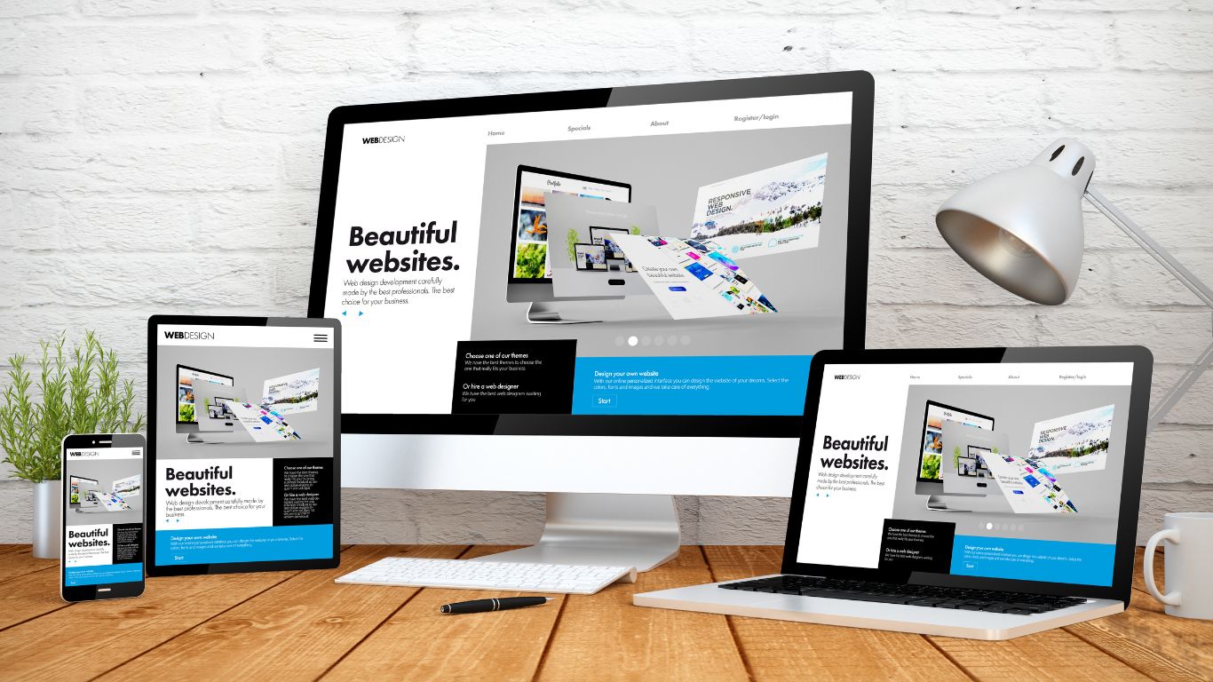
In the contemporary digital landscape, website design goes far beyond mere aesthetics. It serves as a confluence of functionality, immersive user experience, and universal accessibility. When these elements intertwine harmoniously, they birth a website design that stands out for its visual allure, ease of navigation, and rapid loading speeds.
This article aims to explore in-depth the 12 critical elements of good website design, each grounded in data-driven insights.
Prioritize Clear Navigation for Better User Experience
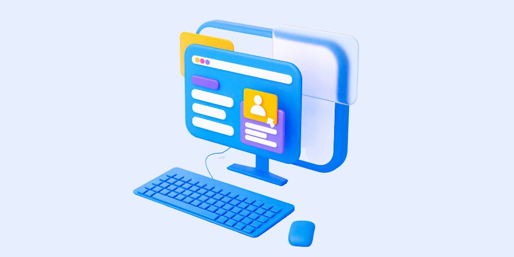
Clear navigation is the backbone of a seamless user experience. In the digital landscape, where users are accustomed to swift and intuitive interactions, a website's navigation plays a pivotal role in meeting their expectations.
1.1 The Necessity of Intuitive Navigation:
Meeting User Expectations: In today's digital era, users expect websites to be user-friendly. They don't want to wrestle with a site's structure or spend excessive time searching for information. They anticipate finding what they need swiftly and efficiently.
Reducing Bounce Rates: Bounce rate, which represents the percentage of visitors who navigate away from a site after viewing only one page, is a critical metric. Research by Smashing Magazine and others has demonstrated that clearer navigation can considerably reduce bounce rates. When users can easily find what they're looking for, they are more likely to explore further, leading to more extended site visits.
1.2 Key Features for Enhanced Navigation:
Dropdown Menus: Dropdown menus are a valuable tool for streamlining information. They allow users to quickly locate topics of interest without overwhelming them with excessive choices. When implemented correctly, dropdown menus can significantly enhance the user's ability to navigate a website efficiently. It is among the essential elements of a good website design.
Breadcrumb Trails: Breadcrumb trails act as a roadmap for users, enabling them to trace back their navigation path. This feature is especially valuable on larger websites with multiple layers of content. Breadcrumbs enhance user orientation and make it easier for users to understand where they are within the site's structure.
Search Bars: For content-rich websites, search bars are crucial. They facilitate the rapid location of specific content. Users can simply enter keywords to find what they need, which enhances their overall experience and saves them time.
Clear navigation is not just among nice-to-have elements for website design but a fundamental aspect of user experience. Meeting user expectations, reducing bounce rates, and incorporating features like dropdown menus, breadcrumb trails, and search bars are key strategies to ensure your website's navigation enhances user satisfaction.
Responsive Design for Mobile Users
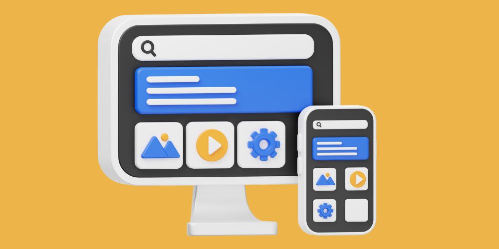
The omnipresence of mobile devices necessitates responsive design. With more than 50% of global web users accessing websites via mobile devices, optimizing your site for these users is imperative to ensure a seamless experience. It is one of the must-have elements for website designing.
2.1 The Shift in Digital Consumption:
Over 50% of global web users access sites via mobile devices, as noted by Statista. This trend is not limited to a specific region or demographic; it's a global phenomenon. Therefore, if your website is not optimized for mobile, you risk alienating significant potential traffic.
2.2 Advantages of Mobile Optimization:
Prolonged Engagement: A responsive design ensures that users don't bounce off your site due to viewing or navigational issues on mobile devices. Users who can easily access and interact with your content on their smartphones or tablets are more likely to stay engaged and explore further.
SEO Benefits: Google's algorithms prioritize mobile-friendly sites, amplifying their visibility on search results. This means that if your website is not optimized for mobile, it may not rank as well in search engine results, leading to a potential loss of organic traffic.
2.3 Key Components of Responsive Design:
Fluid Grids: Responsive design relies on fluid grids, allowing elements on your website to adjust proportionately to the user's screen size. This ensures design consistency across devices, from large desktop screens to small smartphone displays.
Flexible Images: Images also need to be responsive, adapting to different screen sizes to ensure they don't distort or slow down page loads. By using adaptive resizing techniques, you can ensure that images look great on all devices.
Media Queries: Media queries are a CSS technique that applies styles based on the device's characteristics, such as width, height, or orientation. This allows you to tailor the design and layout of your website to provide the best possible experience for mobile users.
Responsive design is not just a trend; it's a necessity in today's digital landscape. Optimizing your website for mobile users ensures prolonged engagement, SEO benefits, and a seamless user experience across all devices. By implementing fluid grids, flexible images, and media queries, you can create a website that caters to the diverse needs of your audience.
Fast Loading Times Are Crucial for Engagement
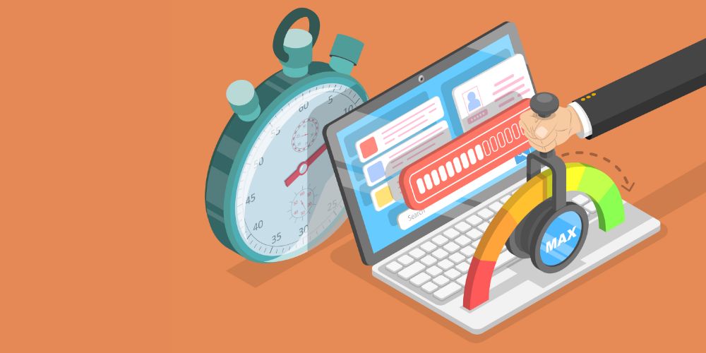
Speed is integral to retaining user interest. In an era where users have increasingly shorter attention spans, the loading time of your website can make or break the user experience.
3.1 User Behavior and Loading Times:
User satisfaction is closely tied to loading times. Studies have shown that even a mere second's delay in page loading can drastically reduce user satisfaction. Google's data highlights the detrimental impact of slow load times, with higher bounce rates for even slight delays.
3.2 Primary Culprits Behind Slow Websites:
Bulky Image Files: While visuals enhance engagement, unoptimized images can become a site's Achilles' heel. Large image files can significantly slow down page loading times, frustrating users and causing them to abandon your site.
Excessive HTTP Requests: Slow loading times often result from many HTTP requests generated by various page elements like scripts, images, and CSS files. Each request adds to the load time, and excessive requests can overwhelm servers.
Clunky Code: Outdated plugins, excessive white spaces, and inline stylings can bog down a site's performance. Clean and efficient code is essential for ensuring that your website loads quickly and smoothly.
3.3 Speed Optimization Strategies:
Utilize tools like Google PageSpeed Insights to identify performance bottlenecks on your website. These tools provide valuable insights into what elements are slowing down your site and offer suggestions for improvement.
Compress images using tools like TinyPNG or opt for modern formats like WebP. Image compression can significantly reduce file sizes without sacrificing quality, resulting in faster loading times.
Reduce HTTP requests by combining CSS and JavaScript files, using CSS sprites to combine multiple images into one, and streamlining the overall design. Fewer requests mean quicker page loading.
Fast loading times are a non-negotiable aspect of user engagement. Users expect websites to load quickly; slow loading times can lead to frustration and abandonment. You can optimize your website's speed and provide a smoother user experience by addressing bulky image files, excessive HTTP requests, and clunky code.
Simple and Intuitive Layout Draws More Engagement
A clutter-free layout can significantly enhance user experience and engagement. When users visit a website, they should immediately grasp its structure and find it easy to navigate.
4.1 Layout and User Engagement:
A confusing or cluttered layout can disorient users, leading to swift exits from your website. The Nielsen Norman Group emphasizes the direct correlation between intuitive layouts and elevated user engagement. Here's how you can achieve it:
Grid-based Layouts: Grid-based layouts organize content into a visually appealing structure. They segregate content into columns and rows, creating a sense of order and making it easier for users to navigate your website. Grids enhance the overall aesthetics and usability of your site.
Visual Hierarchy: Visual hierarchy is vital for guiding a visitor's eyes and attention. By strategically sizing and placing elements, you can draw attention to the most crucial information on your web pages. This ensures that users quickly find and engage with the content they're looking for.
Consistency: Consistency is key to user engagement. Maintaining a standard design across pages reduces the learning curve for users. When elements like navigation menus, fonts, and color schemes remain consistent, users spend less time figuring out your website's interface and more time engaging with your content.
A simple and intuitive layout is fundamental to user engagement. Users appreciate websites that are easy to navigate and visually pleasing. By implementing grid-based layouts, establishing a clear visual hierarchy, and maintaining consistency, you can create a website that draws users in and keeps them engaged.
Accessible Design for All Users is a Must
Web accessibility ensures inclusivity and allows everyone, regardless of disabilities, to access content seamlessly.
5.1 Why Accessibility is Non-negotiable:
Excluding users based on disabilities is ethically problematic and limits potential traffic. An accessible website ensures everyone can access content seamlessly, regardless of impairments. Accessibility is a legal requirement in many regions and a reflection of your commitment to inclusivity and diversity.
5.2 Features Elevating Website Accessibility:
Keyboard Navigation: Vital for users with motor disabilities, keyboard navigation allows users to navigate your website using keyboard inputs alone. Ensuring all interactive elements are accessible via keyboard commands is a basic accessibility requirement.
Alt Text for Images: Providing descriptive alt text for images is essential for accessibility. Alt text is read aloud by screen readers, providing context and information about images to visually impaired users. It's a simple yet powerful way to make your website more inclusive.
Contrast Ratios: High contrast ratios are essential for users with visual impairments. Ensuring that text and background colors have sufficient contrast enhances legibility for all users. This small adjustment can significantly improve the user experience for those with visual challenges.
Web accessibility is not an option but a necessity. It's about making your website usable by everyone, regardless of their abilities. By incorporating features like keyboard navigation, alt text for images, and ensuring contrast ratios meet accessibility standards, you can create a more inclusive and welcoming online environment.
High-Quality Content Establishes Authority
Quality content is the cornerstone of a successful website. It educates and establishes your brand as a trustworthy authority in your niche.
6.1 Content and User Trust:
Quality content is not just about providing information; it's about providing accurate, valuable, and reliable information. When users visit your website and find well-researched, up-to-date, and credible content, it fosters trust in your brand.
6.2 Strategies for Crafting Superior Content:
Thorough Research: Ground your content in facts and data. Back your statements with credible, preferably primary, sources. When users see that your content is well-researched and supported by evidence, they are more likely to trust it.
Simplicity Over Complexity: Avoid jargon and overly technical language unless your audience specifically requires it. Use clear and concise language that the average user can understand. This not only makes your content more accessible but also enhances user trust.
Visual Engagement: Complement text with relevant visuals like images, infographics, and videos. Visual content enhances understanding and retains user attention. It can make complex topics more digestible and engaging.
High-quality content is vital for establishing authority and building trust with your audience. By conducting thorough research, simplifying complex concepts, and incorporating visual elements, you can create content that resonates with users and positions your brand as a credible source of information.
Effective Use of White Space Enhances Clarity
White space, often referred to as "negative space," is a crucial design element that should not be underestimated. Contrary to some beliefs, white space isn't about emptiness; it's about strategically using space to accentuate content and enhance clarity.
7.1 The Role of White Space:
White space serves several essential functions in web design:
Around Text and Titles: White space around text and titles improves focus and comprehension. It separates content from surrounding elements, making it easier for users to read and understand the information.
Between Elements: White space between different website sections demarcates them, ensuring users don't confuse one section for another. It creates a visual hierarchy that guides users through your content.
7.2 Effective Implementation:
To make the most of white space in your web design:
Ensure Adequate Margins: Text and other content elements should have sufficient margins to prevent overcrowding. Proper spacing enhances readability and user experience.
Use Whitespace as a Design Element: White space is not just empty; it's a design element. Use it to create balance, harmony, and emphasis in your website's layout.
Consider Mobile Responsiveness: White space is especially important on mobile devices with smaller screens. Properly implemented white space ensures that content remains legible and well-organized on all devices.
Effective use of white space is a design principle that can significantly enhance the clarity and readability of your website. It's not about eliminating content but creating a harmonious, user-friendly visual experience.
Compelling Call-to-Action (CTA) Buttons Drive User Action
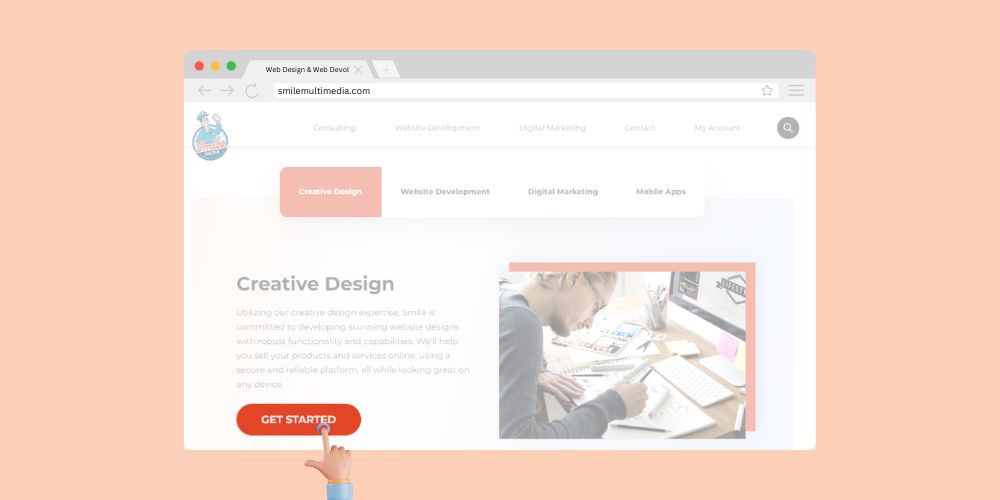
Call-to-action (CTA) buttons are the directional signposts of a website. They guide users, signaling the next steps – be it signing up, purchasing, or simply reading more.
8.1 The Power of Clear CTAs:
CTAs play a pivotal role in driving user action. When crafted effectively, they can:
Capture Attention: Standout colors, contrasting designs, and strategic placement make CTAs highly visible on a webpage, drawing users' attention.
Convey Urgency and Value: Compelling text that conveys urgency and value persuades users to take action. Phrases like "Get Started Now" or "Limited Time Offer" can be highly effective.
8.2 Crafting Irresistible CTAs:
Standout Colors: Use colors that contrast with the background and the rest of the page to make CTAs visually prominent. Typically, bold and vibrant colors work well.
Compelling Text: The text on your CTA buttons should be action-oriented and concise. It should clearly convey what action users will take by clicking the button. For example, "Sign Up" or "Buy Now."
Well-designed and strategically placed CTAs are essential for guiding users toward desired actions on your website. Using standout colors and crafting compelling text can create CTAs that drive user engagement and conversions.
Consistent Branding Builds Trust and Recognition
A website should resonate with your brand identity. Consistency in branding across all touchpoints reinforces brand recall, and fosters trust.
9.1 The Importance of Consistency:
Consistent branding is crucial for several reasons:
Brand Recognition: Consistent use of your logo, colors, fonts, and other brand elements helps users quickly recognize your brand.
Trust Building: When users encounter a consistent brand image across different platforms, it conveys professionalism and reliability, fostering trust.
9.2 Brand-centric Web Design Elements:
Logo Placement: Your logo is a fundamental part of your brand identity. Consistently placing it, preferably at the top left of your website, ensures it's prominently displayed and reinforces brand recognition.
Unified Color Palette: Using the same colors as your brand's color palette throughout your website creates a cohesive look. Consistency in color reinforces brand identity.
Consistent branding is essential for building trust and recognition. When users encounter a cohesive and recognizable brand image across your website and other touchpoints, it strengthens their connection with your brand. It enhances their trust in your products or services.
Feedback Systems Improve User Interaction
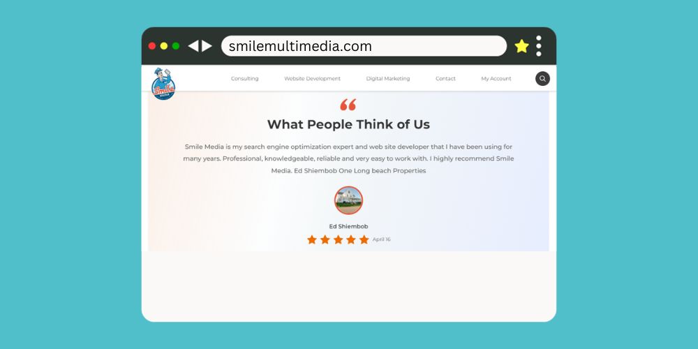
Feedback mechanisms on a website facilitate two-way communication between users and the brand. They provide valuable insights into user preferences and help tailor offerings accordingly.
10.1 Engaging Through Feedback:
Feedback mechanisms serve multiple purposes:
User Engagement: Providing users with a platform to share their thoughts and opinions directly on your website can boost engagement. Users feel heard and valued when their feedback is acknowledged and responded to.
10.2 Effective Feedback Channels:
Comments Section: Including a comments section on your website allows users to share their thoughts, ask questions, and engage in discussions. It's a valuable way to encourage user interaction.
Review and Rating Systems: These systems enable users to rate products or services and provide detailed reviews. This helps other potential customers make informed decisions and gives businesses insights into their offerings' strengths and weaknesses.
Security Features Ensure User Trust

In the age of data breaches and cyber threats, security is paramount for both users and website owners.
11.1 User Trust and Web Security:
A secure website is foundational to building and retaining user trust. When users perceive that their data and interactions are safe on your site, they are more likely to engage and transact confidently.
11.2 Bolstering Website Security:
SSL Certificates: Secure Sockets Layer (SSL) certificates ensure data encryption, securing user data during transmission. Websites with SSL certificates display a padlock icon in the browser's address bar, indicating a secure connection.
Routine Updates: Regularly updating the content management system (CMS), plugins, and themes is crucial for security. Updates often include patches for known vulnerabilities, reducing the risk of breaches.
Frequent Testing and Updating Reflect Care
Staleness is the enemy of user engagement. Frequent testing and updating of your website demonstrate that your brand is active and invested in providing value.
12.1 The Need for Regular Updates:
Website visitors expect fresh content and up-to-date features. Stale content can lead to decreased user engagement and interest.
12.2 Continuous Improvement Strategies:
A/B Testing: A/B testing involves comparing two web page versions to determine which one performs better regarding user engagement and conversions. By regularly conducting A/B tests, you can identify which version of a page element resonates more with users and make data-driven improvements.
Incorporating Feedback: Listen to user feedback and regularly update your website based on their suggestions and preferences. User-centric updates demonstrate that you value your audience's input and are committed to improving their experience.
Frequent testing and updating of your website are essential to maintaining user engagement and relevance. By staying proactive in making improvements and listening to user feedback, you demonstrate care for your audience's needs and expectations.
Conclusion:
User-friendly website design hinges on these 12 elements. Prioritizing clear navigation, responsiveness, speed, and all the facets discussed ensures a comprehensive, engaging user experience. In this ever-evolving digital landscape, staying updated and user-centric is the key to creating a lasting impact.
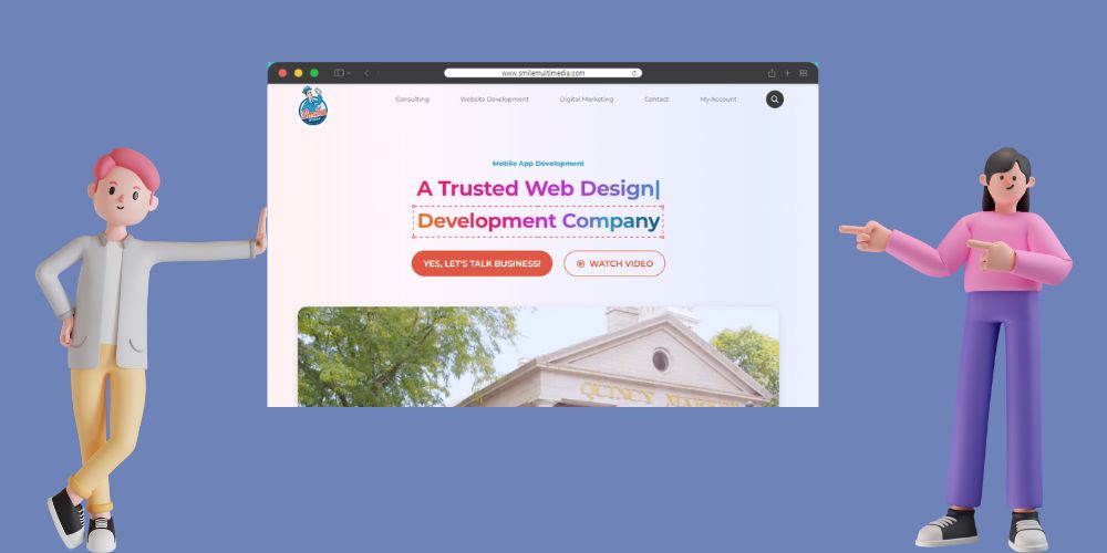
If you want your website to have all these key elements of website design, Smile MEDIA can take good care of it!
FAQs:
1. Why is functionality as important as aesthetics in website design?
While aesthetics attract users, functionality determines their overall experience. A visually appealing site lacking smooth navigation can frustrate users. Conversely, a functional but drab site might not retain attention. Both aspects are crucial for user retention and engagement.
2. How does user experience (UX) impact website effectiveness?
User experience (UX) defines all user interactions with a site. Good UX ensures ease of navigation and content accessibility, fostering user satisfaction and repeated visits. Poor UX can deter users, reducing site effectiveness and conversion rates.
3. Why is accessibility important in website design?
Accessibility ensures all users, including those with disabilities, can use the website effortlessly. It not only promotes inclusivity but also broadens the site's audience reach, potentially leading to increased traffic and engagement.
4. How do loading speeds affect user behavior on websites?
Loading speeds directly impact user satisfaction. Slow-loading sites can increase bounce rates as users generally lack patience for delays. Faster websites ensure users access content promptly, enhancing their overall experience and likelihood to return.
5. What are the key components of a mobile-responsive website?
A mobile-responsive website adjusts to different screen sizes, ensuring optimal viewing on devices from desktops to smartphones. Key components include fluid grids, flexible images, and media queries that adapt the design based on device characteristics.


