
Color design is one of the most interesting, yet complex aspects of marketing. Even outside of marketing, we use colors alone just to establish an identity for ourselves. All colors have both positive and negative identities. For example, red is often associated with being ‘brave’, ‘seductive’ or ‘filled with anger’, while yellow is often associated with being ‘happy’, ‘energetic’ or ‘cowardly’.
There is no right or wrong color, but it’s important to be aware of how the colors you choose will affect potential customers. If you apply the wrong color to your company identity, you could be sending out the wrong message.
5 Facts to Know
1. 90% of Snap Judgments made about Products are Based on Color Alone…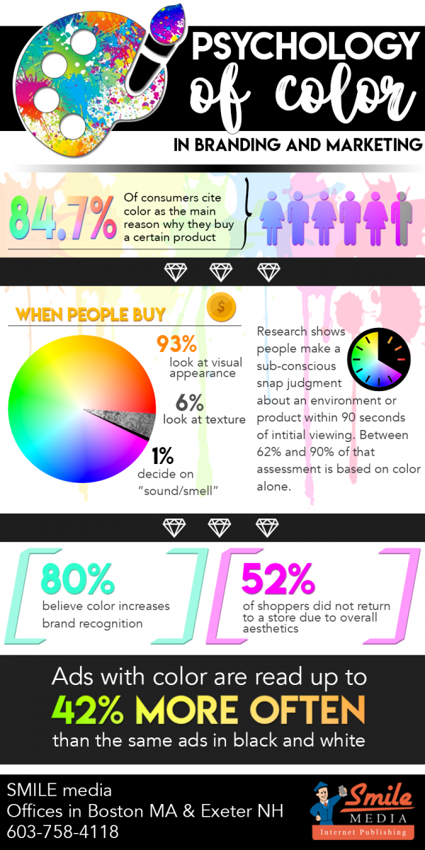
That’s right. According to researcher Satyendra Singh of Canada, color is the strongest factor in first impressions of your product. So your design better be unique and clean, in order to stand out from your competitors. A good example of brand design could be that of name brand and “off brand” products.
Just think of Oreos vs. Sandwich Cookies – Oreos clearly have more appealing packaging and design, drawing you to buy their product over the Great Value version.
2. Our Brains Prefer Familiarity…
This is especially important because colors build brand identity. Your colors need to ensure differentiation from competitors so as to not blend into the mix. When it comes to picking the “right” color, predicting the consumer’s reaction to the color is a more valuable measurement of success than the individual color itself.
Solar City owners know that consumers tend to buy the product to feel like they’re helping the environment, so they chose colors that played best into feeding that emotion.
3. There are 5 Dimensions of Brand Personality…
While brands can certainly cross between two traits, usually there’s just one that sticks out the most. It’s far more important to choose colors based on the personality you want to portray rather than aligning with stereotypical color associations.
4. Women and Men respond to Color Trends Differently…
The environment one grows up in, along with the cultural perceptions of that environment, subconsciously influence the decisions they make, especially when it comes to product purchases. Though it is now widely believed that pink is for girls while blue is for boys, it used to be the opposite.
Another study discusses that while men prefer bold and shaded colors, women typically prefer softer pastels with lighter, brighter hues.
5. If You Don’t Stand Out, You Won’t Be Seen...
The 'Isolation Effect' refers to the idea that an item that sticks out like a sore thumb is more likely to be recalled later. It is often best to make the structure of your logo, website, etc. on analogous colors, yet also complimenting them with a complimentary (tertiary) color. Your structure should be an analogous set of colors. For websites, many choose to go with greys or pale blues. Next, pull out a complimentary color based on the triadic color scale. If your color structure is monochromatic (grey-scale), you can choose any color as your accent.
There is no magical answer or all-knowing guide on choosing a color for your brand. However, we at SMILE media hope that this information helps you narrow down your target audience, so you can appropriate what colors may work best for your business.
Still not sure how to grab your customers’ attention? SMILE media is a professional Boston web development agency that understands the ins and outs of customer appeal and retention. Contact us here to learn more.